Recreating the App Store's expandable text in SwiftUI
Table of Contents
The ExpandableText view #
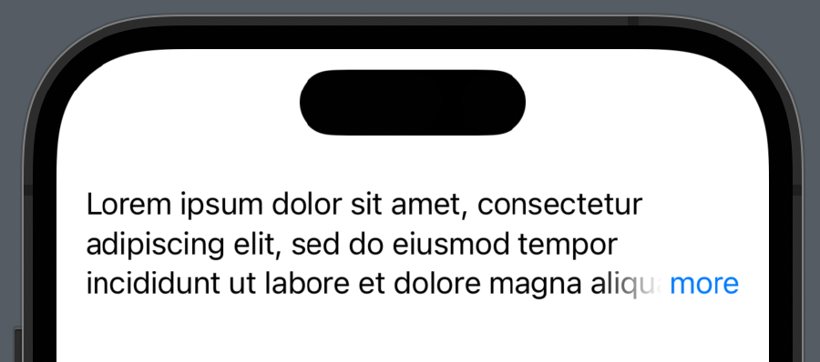
Here’s what we’re going to build:

Full code available on GitHub! We start by creating a new SwiftUI view called ExpandableText:
1public struct ExpandableText: View {2 private let text: String3 4 public init(_ text: String) {5 self.text = text.trimmingCharacters(in: .whitespacesAndNewlines)6 }7 8 // Body goes here9}We pass the text within the view initializer, trimmed of any leading or trailing whitespace and newline characters.
We keep track of the expanded state with a @State variable called isExpanded. We leverage the lineLimit modifier to return nil (as many lines as needed) if isExpanded is false, and a fixed value otherwise (3 for example).
1@State private var isExpanded: Bool = false2 3public var body: some View {4 Text(.init(text))5 .frame(maxWidth: .infinity, alignment: .leading)6 .lineLimit(isExpanded ? nil : 3)7}Note that if the text fits within the fixed line limit, we don’t need to make it expand. To check this, we introduce a @State variable called isTruncated. This variable will be true if the text is actually truncated when forced to fit in 3 lines, false otherwise.
To check if text is truncated in SwiftUI, we follow the technique used in this great blog post from Federico Zanetello:
1@State private var isTruncated: Bool = false 2@State private var intrinsicSize: CGSize = .zero 3@State private var truncatedSize: CGSize = .zero 4 5public var body: some View { 6 Text(.init(text)) 7 .frame(maxWidth: .infinity, alignment: .leading) 8 .lineLimit(isExpanded ? nil : lineLimit) 9 .readSize { size in10 truncatedSize = size11 isTruncated = truncatedSize != intrinsicSize12 }13 .background(14 Text(.init(text))15 .frame(maxWidth: .infinity, alignment: .leading)16 .lineLimit(nil)17 .fixedSize(horizontal: false, vertical: true)18 .hidden()19 .readSize { size in20 intrinsicSize = size21 isTruncated = truncatedSize != intrinsicSize22 }23 )24}The text size when not truncated is calculated in the background, using the background modifier, and compared to the actual text size when constrained to the line limit. If the two sizes are different, then the text definitely requires truncation.
The readSize modifier for reading a SwiftUI view’s size at runtime is adapted from another awesome blog post on fivestars:
1struct SizePreferenceKey: PreferenceKey { 2 static var defaultValue: CGSize = .zero 3 static func reduce(value: inout CGSize, nextValue: () -> CGSize) {} 4} 5 6extension View { 7 func readSize(onChange: @escaping (CGSize) -> Void) -> some View { 8 background( 9 GeometryReader { geometryProxy in10 Color.clear11 .preference(key: SizePreferenceKey.self, value: geometryProxy.size)12 }13 )14 .onPreferenceChange(SizePreferenceKey.self, perform: onChange)15 }16}Trimming multiple new lines when text is truncated #
If the text is truncated, we want to remove any 2+ newlines from the text. This is to avoid having newlines at the end of the truncated text, which would look weird. The App Store does this as well.
1var body: some View {2 Text(.init(!isExpanded && isTruncated ? textTrimmingDoubleNewlines : text))3 /* ... */4}5 6private var textTrimmingDoubleNewlines: String {7 text.replacingOccurrences(of: #"\n\s*\n"#, with: "\n", options: .regularExpression)8}We use a regular expression to replace any double newlines with a single newline. The regular expression is \n\s*\n, which matches any newline character followed by any number of whitespace characters followed by another newline character. The replacement string is just a single newline character.
Adding the expand button… #
At the end of the text, we add a more button that expands the text when tapped. We use the overlay modifier to add the button on top of the text, and position it at the trailing edge of the last text baseline.
1public var body: some View { 2 Text(/* ... */) 3 /* ... */ 4 .overlay(alignment: .trailingLastTextBaseline) { 5 if !isExpanded, isTruncated { 6 Button { 7 withAnimation { isExpanded.toggle() } 8 } label: { 9 Text("more")10 }11 }12 }13}…and a fade effect #
To make the text fade out when it’s truncated, we use a LinearGradient mask. We use a VStack to mask the top of the text, and a HStack to mask the trailing edge of the text. The LinearGradient is used to fade out the text from the trailing edge. The size of the LinearGradient is determined by the size of the more button, which is calculated in the background.
1@State private var moreTextSize: CGSize = .zero 2 3public var body: some View { 4 Text(/* ... */) 5 /* ... */ 6 .applyingTruncationMask(size: moreTextSize, enabled: !isExpanded && isTruncated) 7 .background( 8 Text(moreButtonText) 9 .hidden()10 .readSize { moreTextSize = $0 }11 )12}The applyingTruncationMask modifier is defined as follows:
1private struct TruncationTextMask: ViewModifier { 2 3 let size: CGSize 4 let enabled: Bool 5 6 @Environment(\.layoutDirection) private var layoutDirection 7 8 func body(content: Content) -> some View { 9 if enabled {10 content11 .mask(12 VStack(spacing: 0) {13 Rectangle()14 HStack(spacing: 0) {15 Rectangle()16 HStack(spacing: 0) {17 LinearGradient(18 gradient: Gradient(stops: [19 Gradient.Stop(color: .black, location: 0),20 Gradient.Stop(color: .clear, location: 0.9)21 ]),22 startPoint: layoutDirection == .rightToLeft ? .trailing : .leading,23 endPoint: layoutDirection == .rightToLeft ? .leading : .trailing24 )25 .frame(width: size.width, height: size.height)26 27 Rectangle()28 .foregroundColor(.clear)29 .frame(width: size.width)30 }31 }.frame(height: size.height)32 }33 )34 } else {35 content36 .fixedSize(horizontal: false, vertical: true)37 }38 }39}40 41extension View {42 func applyingTruncationMask(size: CGSize, enabled: Bool) -> some View {43 modifier(TruncationTextMask(size: size, enabled: enabled))44 }45}Note that we use the @Environment(\.layoutDirection) property wrapper to determine the layout direction, and flip the gradient start and end points if the layout direction is right-to-left.
Accessibility #
Because we used standard SwiftUI elements, the expandable text supports color scheme variants out of the box:
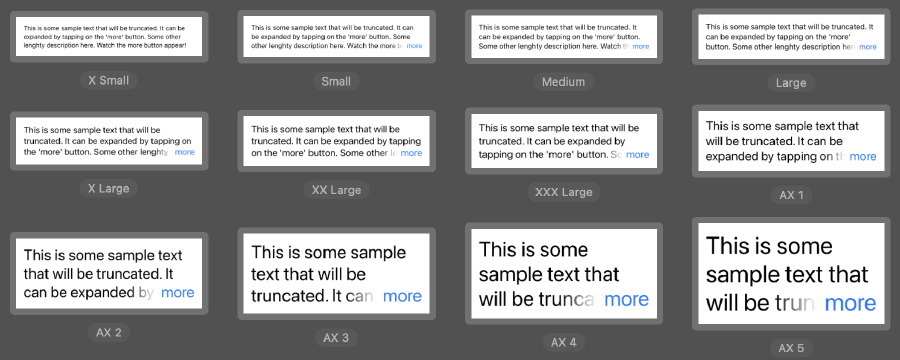
And also dynamic type variants:
Note that the more button is not visible in the X Small dynamic type variant, because the text fits within the line limit.
Conclusion #
In this post, we’ve seen how to create an expandable text view in SwiftUI. We’ve also seen how to use the background and overlay modifiers to calculate the size of a view at runtime, and how to use a LinearGradient mask to fade out the text when it’s truncated.
The full source code for this post is available on GitHub as a Swift package!
References #
- How to read a view size in SwiftUI on fivestars.blog
- How to check if Text is truncated in SwiftUI? on fivestars.blog
- NuPlay/ExpandableText for inspiration and some portions of code