A first look at Swift Charts: building a horizontal bar chart
Table of Contents
Introduction #
Swift Charts is a new library that was introduced by Apple during WWDC22. It provides a set of views and modifiers that can be used to create charts and graphs in SwiftUI.
Data model #
Let’s start by creating a data model. We will define a struct called Entry, which will represent the data that we want to display in our chart. Each Entry will have a period and an amount:
1private struct Entry: Identifiable {2 let id = UUID()3 let period: String4 let amount: Int5}Note that we are conforming our Entry struct to the Identifiable protocol by providing a default id property. This is required by the Chart initializer we’re going to use later.
Next, we will create an array of Entry objects that will be used to populate our chart. We will use the following sample data:
let data: [Entry] = [ .init(period: "Today", amount: 5), .init(period: "This Week", amount: 50), .init(period: "This Month", amount: 100), .init(period: "This Year", amount: 150), .init(period: "All Time", amount: 220),]Chart view #
Now, let’s build our horizontal bar chart. We will wrap it in a VStack to give it some padding and a nice title.
Make sure to import Charts at the top of your Swift file.
1VStack(alignment: .leading, spacing: spacing) { 2 Text("Downloads") 3 .font(.title3) 4 .fontWeight(.semibold) 5 6 GroupBox { 7 Chart(data) { item in 8 BarMark( 9 x: .value("Amount", item.amount),10 y: .value("Period", item.period)11 )12 }13 .fixedSize(horizontal: false, vertical: true)14 }15}Inside the Chart view, we are using a BarMark to create the bars for our chart. We are setting the x and y values for each bar using the amount and period properties of each Entry.
We use the .fixedSize(horizontal: false, vertical: true) modifier to make sure that the chart is not stretched vertically, and instead, it takes up the minimum amount of space required to display the chart.
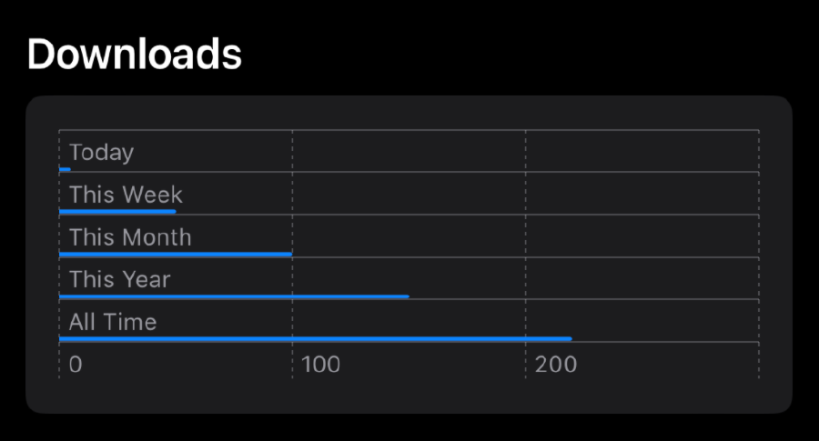
Here’s the initial result:

It’s not very pretty yet, but we can easily customize it to make it look better.
Customization #
Let’s start by adding a trailing annotation to each bar. We will use the annotation modifier on the BarkMark to do this:
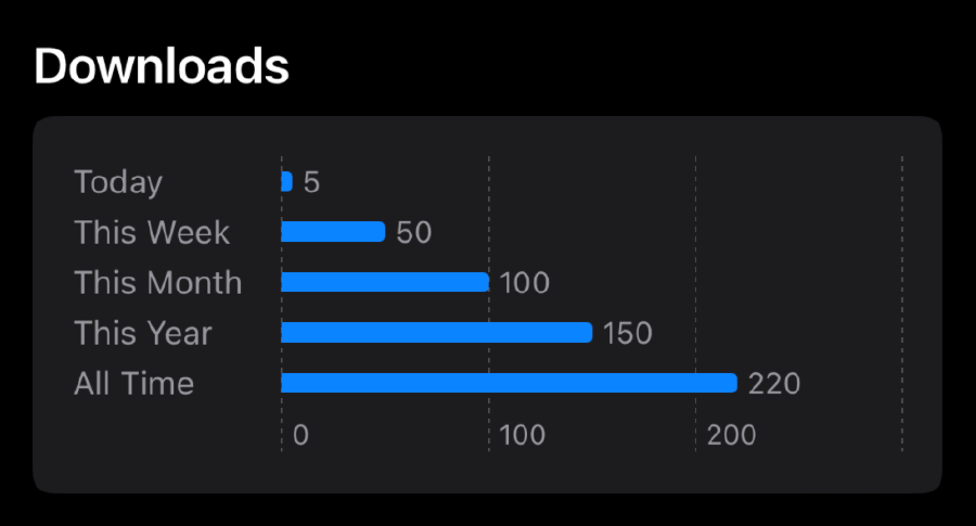
1Chart(data) { item in2 BarMark(/* ... */)3 .annotation(position: .trailing) { 4 Text(item.amount.formatted())5 .foregroundColor(.secondary)6 .font(.caption)7 }8}The annotation will display the amount of downloads for each period. Then we’ll add a y-axis label displaying the period. We will use the chartYAxis modifier to do this:
1Chart(data) { item in 2 /* ... */ 3} 4.fixedSize(horizontal: false, vertical: true) 5.chartYAxis { 6 AxisMarks(preset: .extended, position: .leading) { _ in 7 AxisValueLabel(horizontalSpacing: 15) 8 .font(.footnote) 9 }10}Finally, we can adjust the thickness of the bars by providing a width value to the BarMark initializer:
1BarMark(2 /* ... */3 width: .fixed(8) 4)And there you have it! With just a few lines of code, we’ve created a nice-looking horizontal bar chart using Swift Charts. Here’s the final result:

This is just a small example of what is possible with Swift Charts. There are many other types of charts and graphs that can be created using this library, like line charts, pie charts, scatterplots, histograms, and more.
To learn more about Swift Charts and its capabilities, check out the official documentation!